Exploratory Data Analysis
import pandas as pd
import numpy as np
import matplotlib.pyplot as plt
import seaborn as sns
%matplotlib inline
df_train = pd.read_csv('train.csv')
df_test = pd.read_csv('test.csv')
print('>>>>>Train data')
print('The number of rows in training data set:',df_train.shape[0])
print('The number of rows in training data set:',df_train.shape[1])
>>>>>Train data
The number of rows in training data set: 1460
The number of rows in training data set: 81
print('>>>>>Test data')
print('The number of rows in test data set:',df_test.shape[0])
print('The number of rows in test data set:',df_test.shape[1])
>>>>>Test data
The number of rows in test data set: 1459
The number of rows in test data set: 80
df_train.head()
| Id | MSSubClass | MSZoning | LotFrontage | LotArea | Street | Alley | LotShape | LandContour | Utilities | ... | PoolArea | PoolQC | Fence | MiscFeature | MiscVal | MoSold | YrSold | SaleType | SaleCondition | SalePrice | |
|---|---|---|---|---|---|---|---|---|---|---|---|---|---|---|---|---|---|---|---|---|---|
| 0 | 1 | 60 | RL | 65.0 | 8450 | Pave | NaN | Reg | Lvl | AllPub | ... | 0 | NaN | NaN | NaN | 0 | 2 | 2008 | WD | Normal | 208500 |
| 1 | 2 | 20 | RL | 80.0 | 9600 | Pave | NaN | Reg | Lvl | AllPub | ... | 0 | NaN | NaN | NaN | 0 | 5 | 2007 | WD | Normal | 181500 |
| 2 | 3 | 60 | RL | 68.0 | 11250 | Pave | NaN | IR1 | Lvl | AllPub | ... | 0 | NaN | NaN | NaN | 0 | 9 | 2008 | WD | Normal | 223500 |
| 3 | 4 | 70 | RL | 60.0 | 9550 | Pave | NaN | IR1 | Lvl | AllPub | ... | 0 | NaN | NaN | NaN | 0 | 2 | 2006 | WD | Abnorml | 140000 |
| 4 | 5 | 60 | RL | 84.0 | 14260 | Pave | NaN | IR1 | Lvl | AllPub | ... | 0 | NaN | NaN | NaN | 0 | 12 | 2008 | WD | Normal | 250000 |
5 rows × 81 columns
df_test.head()
| Id | MSSubClass | MSZoning | LotFrontage | LotArea | Street | Alley | LotShape | LandContour | Utilities | ... | ScreenPorch | PoolArea | PoolQC | Fence | MiscFeature | MiscVal | MoSold | YrSold | SaleType | SaleCondition | |
|---|---|---|---|---|---|---|---|---|---|---|---|---|---|---|---|---|---|---|---|---|---|
| 0 | 1461 | 20 | RH | 80.0 | 11622 | Pave | NaN | Reg | Lvl | AllPub | ... | 120 | 0 | NaN | MnPrv | NaN | 0 | 6 | 2010 | WD | Normal |
| 1 | 1462 | 20 | RL | 81.0 | 14267 | Pave | NaN | IR1 | Lvl | AllPub | ... | 0 | 0 | NaN | NaN | Gar2 | 12500 | 6 | 2010 | WD | Normal |
| 2 | 1463 | 60 | RL | 74.0 | 13830 | Pave | NaN | IR1 | Lvl | AllPub | ... | 0 | 0 | NaN | MnPrv | NaN | 0 | 3 | 2010 | WD | Normal |
| 3 | 1464 | 60 | RL | 78.0 | 9978 | Pave | NaN | IR1 | Lvl | AllPub | ... | 0 | 0 | NaN | NaN | NaN | 0 | 6 | 2010 | WD | Normal |
| 4 | 1465 | 120 | RL | 43.0 | 5005 | Pave | NaN | IR1 | HLS | AllPub | ... | 144 | 0 | NaN | NaN | NaN | 0 | 1 | 2010 | WD | Normal |
5 rows × 80 columns
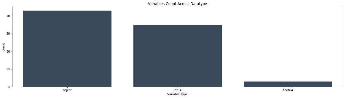
def variable_dtype_plot(df):
    '''bar plot indicating the count of data types
        present in the dataframe'''
    df_dtype = pd.DataFrame(df.dtypes.value_counts()).reset_index().rename(columns={"index":"datatype",0:"count"})
    fig,ax = plt.subplots()
    fig.set_size_inches(20,5)
    sns.barplot(data=df_dtype,x="datatype",y="count",ax=ax,color="#34495e")
    ax.set(xlabel='Variable Type', ylabel='Count',title="Variables Count Across Datatype")
    plt.show()
print('Train data column types')
variable_dtype_plot(df_train)
Train data column types
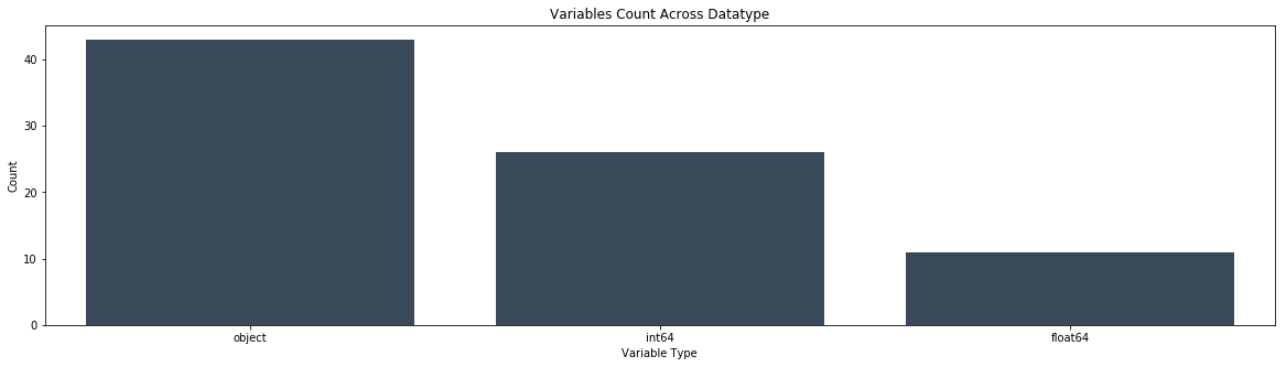
print('Test data column types')
variable_dtype_plot(df_test)
Test data column types
num = [f for f in df_train.columns if df_train.dtypes[f] != 'object']
numdf=pd.melt(df_train,value_vars=num)
numgrid=sns.FacetGrid(numdf,col='variable',col_wrap=4,sharex=False,sharey=False)
numgrid=numgrid.map(sns.distplot,'value')
numgrid
<seaborn.axisgrid.FacetGrid at 0x197ffb9b550>
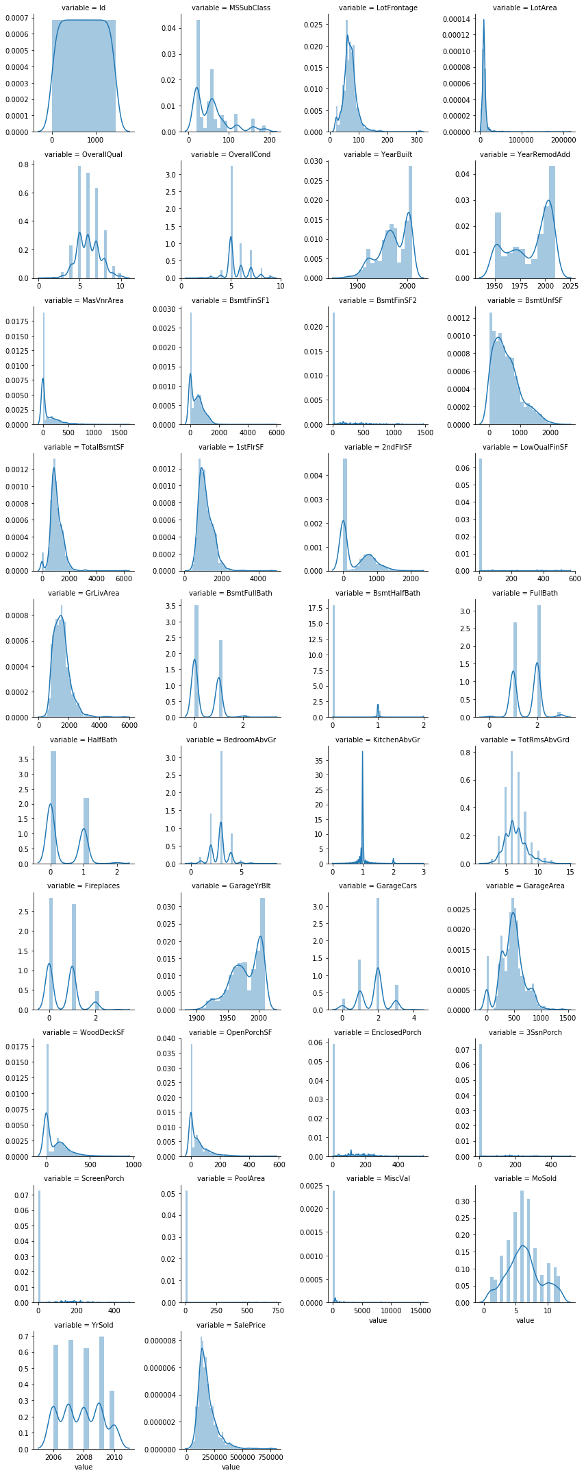
it is also important to check whether the distributions in our training and test sets are similar to each other. Since our models can only learn to make predictions for the kinds of data they have seen, if the distributions are very different, our models may not perform as well as we would hope. So we could plot the above histogram and count plots for test data and check once
##count plot of categorical attributes
col = [f for f in df_train.columns if df_train.dtypes[f] == 'object']
coldf=pd.melt(df_train,value_vars=col)
colgrid=sns.FacetGrid(coldf,col='variable',col_wrap=4,size=6,aspect=.6,sharex=False,sharey=False)
plt.xticks(rotation=90)
colgrid = colgrid.map(sns.countplot,'value')
plt.tight_layout()
plt.subplots_adjust(hspace=0.5, wspace=0.4)


###rotating x axis labels to prevent overlapping
for ax in colgrid.axes:
    for label in ax.get_xticklabels():
        label.set_rotation(90)
colgrid
<seaborn.axisgrid.FacetGrid at 0x197ff745470>
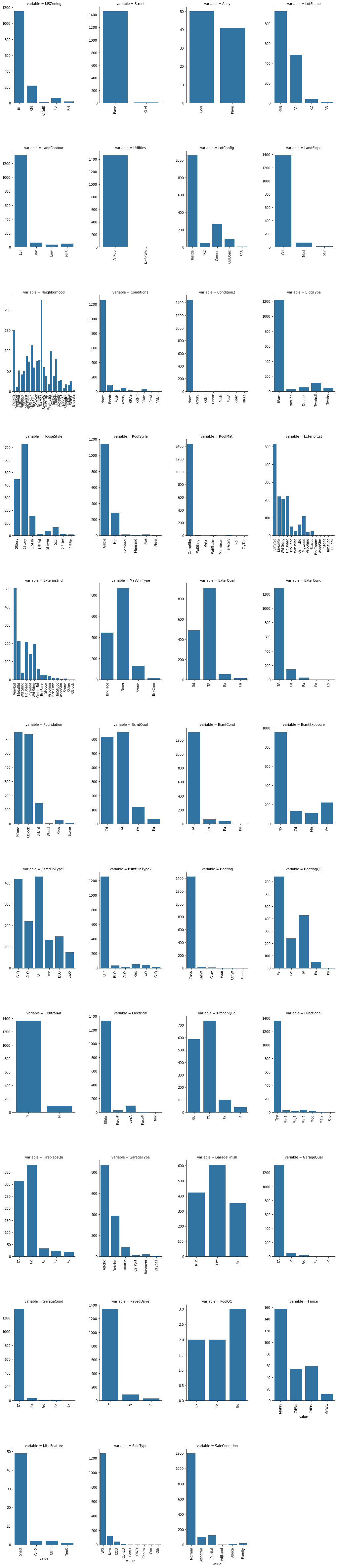
Here we could merge categories which are low in count and similar such as in Foundation category ‘Wood’ and ‘Stone’ into single ‘Other’ category
def boxplot(x,y,**kwargs):
            sns.boxplot(x=x,y=y)
            x = plt.xticks(rotation=90)

#cat = [f for f in train_df.columns if train_df.dtypes[f] == 'object']

p = pd.melt(df_train, id_vars='SalePrice', value_vars=col)
g = sns.FacetGrid (p, col='variable', col_wrap=2, sharex=False, sharey=False, size=5)
g = g.map(boxplot, 'value','SalePrice')
g
<seaborn.axisgrid.FacetGrid at 0x19788b73f60>

##separate variables into new data frames
numeric_data = df_train.select_dtypes(include=[np.number])
cat_data = df_train.select_dtypes(exclude=[np.number])
print ("There are {} numeric and {} categorical columns in train data".format(numeric_data.shape[1],cat_data.shape[1]))
There are 38 numeric and 43 categorical columns in train data
Bivariate Analysis
Having looked at some of our variables individually, let’s move on to exploring the relationships between them. Of course, most interesting will be the relationship between the target variable (sale price) and the features we will use for prediction. However, as we will see, studying relationships among features can also be important.
Numerical variables
For numerical features, scatter plots are the go-to tool. Since the total living area of a house is likely to be an important factor in determining its price, let’s create one for GrLivArea and SalePrice. We’ll plot the living area against the log of the sale price as well for comparison.
Correlation Analysis
Corelations between attributes It is useful to know whether some pairs of attributes are correlated and how much. For many ML algorithms correlated features might make some trouble, ideally we should try to get a set of independent features. However, there exist some methods for deriving features that are as uncorrelated as possible (google for PCA, ICA, autoencoder, dimensionality reduction, manifold learning, etc.).
Pandas offers us out-of-the-box three various correlation coefficients via the DataFrame.corr() function: standard Pearson correlation coefficient, Spearman rank correlation, Kendall Tau correlation coefficient
We are basically going to reduce the dimensionality of our data with either of these methods…important to remove redundant data and have independant variable which are not correlated to each other and explains large variance in data…
we should use covariance matrix only when the data is scaled else use correlation matrix which performs standardization during its operation.
The relationship between the independent variables and the dependent variables is distorted by the very strong relationshi p between the independent variables, leading to the likelihood that our interpretation of relationships will be incorrect.
Multicollinearity - Extent to which a variable can be explained by the other variables in the analysis. As multicollinearity increases, it complicates the interpretation of the variate because it is more difficult to ascertain the effect of any single variable, owing to their interrelationships. Hair et al (2013, p.2). The simplest and most obvious means of identifying collinearity is an examination of the correlation matrix for the independent variables. The presence of high correlations (generally .90 and higher) is the first indication of substantial collinearity. Hair et al (2013, p. 196). The regression model can be tested for multicollinearity by examining the collinearity statistics. Multicollinearity is analyzed through tolerance and variance inflation factor (VIF). As a rule of thumb, if the VIF of a variable exceeds 10, that variable is said to be highly collinear and will pose a problem to regression analysis (Hair et al., 2013). A direct measure of multicollinearity is tolerance, which is defined as the amount of variability of the selected independent variable not explained by the other independent variables. Tolerance is calculated as 1 - R2. For example, if the other independent variables explain 25 percent of independent variable X1 (R2 = .25), then the tolerance value of X1 is .75 (1.0 - .25 = .75). Where R2 is the Coefficient of Determination. A second measure of multicollinearity is the variance inflation factor (VIF), which is calculated simply as the inverse of the tolerance value. In the preceding example with a tolerance of .75, the VIF would be 1.33 (1.0 ÷ .75 = 1.33). Source Hair et al (2013, p. 197)
PCA is normaly used for avoiding multicollinearity, as well as simply procedure as performing PCA and select the most relevant variable per component (normally in Finances, where the interpretation of the variables of the model is very important, in other disciplines you can use all the variables per component achieving a better fitting results).
#correlation plot
plt.rcParams['figure.figsize'] = (10.0, 8.0)
sns.set_style()
corr = numeric_data.corr()
sns.heatmap(corr,cmap="RdYlBu")
<matplotlib.axes._subplots.AxesSubplot at 0x19789fa93c8>
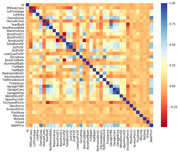
corr['SalePrice'].sort_values(ascending=False)
SalePrice        1.000000
OverallQual      0.790982
GrLivArea        0.708624
GarageCars       0.640409
GarageArea       0.623431
TotalBsmtSF      0.613581
1stFlrSF         0.605852
FullBath         0.560664
TotRmsAbvGrd     0.533723
YearBuilt        0.522897
YearRemodAdd     0.507101
GarageYrBlt      0.486362
MasVnrArea       0.477493
Fireplaces       0.466929
BsmtFinSF1       0.386420
LotFrontage      0.351799
WoodDeckSF       0.324413
2ndFlrSF         0.319334
OpenPorchSF      0.315856
HalfBath         0.284108
LotArea          0.263843
BsmtFullBath     0.227122
BsmtUnfSF        0.214479
BedroomAbvGr     0.168213
ScreenPorch      0.111447
PoolArea         0.092404
MoSold           0.046432
3SsnPorch        0.044584
BsmtFinSF2      -0.011378
BsmtHalfBath    -0.016844
MiscVal         -0.021190
Id              -0.021917
LowQualFinSF    -0.025606
YrSold          -0.028923
OverallCond     -0.077856
MSSubClass      -0.084284
EnclosedPorch   -0.128578
KitchenAbvGr    -0.135907
Name: SalePrice, dtype: float64
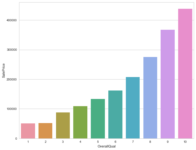
print('>>>>>>The average sale price based on Overall quality of houses')
df_train.groupby('OverallQual').agg({'SalePrice':np.average})
>>>>>>The average sale price based on Overall quality of houses
| SalePrice | |
|---|---|
| OverallQual | |
| 1 | 50150.000000 |
| 2 | 51770.333333 |
| 3 | 87473.750000 |
| 4 | 108420.655172 |
| 5 | 133523.347607 |
| 6 | 161603.034759 |
| 7 | 207716.423197 |
| 8 | 274735.535714 |
| 9 | 367513.023256 |
| 10 | 438588.388889 |
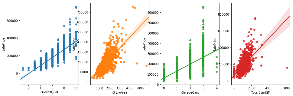
fig,axs = plt.subplots(ncols=4,figsize=(16,5))
sns.regplot(x='OverallQual', y='SalePrice', data=df_train, ax=axs[0])
sns.regplot(x='GrLivArea', y='SalePrice', data=df_train, ax=axs[1])
sns.regplot(x='GarageCars', y='SalePrice', data=df_train, ax=axs[2])
sns.regplot(x='TotalBsmtSF',y='SalePrice', data=df_train, ax=axs[3])
plt.show()
MultiCorrelation Analysis
I think this VIF method is more particular to handle multicolinearity. PCA works to handle multicolinearity, and it also works even if there is no multicolinearity, but you simply want to reduce number of features. Multicollinearity and information gain: In our case we have a fair number of independant variables and we need to keep in mind that adding irrelevant variables will degrade performance of models.Many variables maybe intercorrelated which would not add value/information and we need to avoid this multicollinearity We can calculate the Variance Inflation Factor(on independant variables) and drop variables with high VIF(usually keep values between 5-10,drop greater than 10)
we can use ridge regression or lasso if we have large multicollinearity problem in our data
From the above correlation plot we can drop high correlated independant variables,but calculating the VIF will indicate high multicollinearity of the variable with other variables. Collinearity between factors is quite complicated—>https://stats.stackexchange.com/questions/18084/collinearity-between-categorical-variables
The variance inflation factor can be used to assess multicollinearity. Multicollinearity refers to the fact that your predictor variables are correlated. When just two variables are collinear, it is easy to see. But collinearity can exist amongst several variables (hence ‘multi-‘), which is harder to detect. If you were to run a multiple regression in which one of your X variables were the response and your other X variables were taken as predictors, you would hope to find a multiple R2=0R2=0. That would mean that they are perfectly uncorrelated. With observational data that is very uncommon, though. As the R2jRj2 for each of your variables goes up, the degree of multicollinearity increases. This will cause your standard errors to be larger than they would otherwise have been (if your X variables had been perfectly uncorrelated). To find out how much larger the variance of the sampling distribution for the jthjth variable is, you can check the VIF. You calculate the VIF as so:
VIF=1/1−R2j
numdata = numeric_data.copy()
numdata.dropna(inplace=True)
ordered_cols=['OverallQual',
'OverallCond',
'BsmtFullBath',
'BsmtHalfBath',
'FullBath',
'HalfBath',
'TotRmsAbvGrd',
'Fireplaces',
'GarageCars']
numdata.drop(ordered_cols,axis=1,inplace=True)
from statsmodels.stats.outliers_influence import variance_inflation_factor
def calculate_vif_(X,dependent_col):
    X = X.drop([dependent_col], axis=1)
    variables = list(X.columns)
    vif = {variable:variance_inflation_factor(exog=X.values, exog_idx=ix) for ix,variable in enumerate(list(X.columns))}
    return vif
calculate_vif_(numdata,'SalePrice')
C:\Users\Nithin\Anaconda3\lib\site-packages\statsmodels\stats\outliers_influence.py:167: RuntimeWarning: divide by zero encountered in double_scalars
  vif = 1. / (1. - r_squared_i)


{'1stFlrSF': inf,
 '2ndFlrSF': inf,
 '3SsnPorch': 1.0374586668460639,
 'BedroomAbvGr': 26.346849344870442,
 'BsmtFinSF1': inf,
 'BsmtFinSF2': inf,
 'BsmtUnfSF': inf,
 'EnclosedPorch': 1.420753646100865,
 'GarageArea': 18.632900482836476,
 'GarageYrBlt': 26068.710268947249,
 'GrLivArea': inf,
 'Id': 4.0873001659175667,
 'KitchenAbvGr': 35.584884758862358,
 'LotArea': 3.4178204445791973,
 'LotFrontage': 17.204517445374506,
 'LowQualFinSF': inf,
 'MSSubClass': 4.6763326155130462,
 'MasVnrArea': 1.9191583507401866,
 'MiscVal': 1.0932957458222041,
 'MoSold': 6.7354472332980349,
 'OpenPorchSF': 1.9374836995438445,
 'PoolArea': 1.1678650661766947,
 'ScreenPorch': 1.2051698563068025,
 'TotalBsmtSF': inf,
 'WoodDeckSF': 1.9174488662403557,
 'YearBuilt': 16837.481239291221,
 'YearRemodAdd': 18126.82085265257,
 'YrSold': 16830.952138075085}
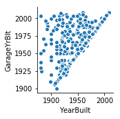
sns.pairplot(x_vars='YearBuilt',y_vars='GarageYrBlt',data=df_train)
<seaborn.axisgrid.PairGrid at 0x197927fd6d8>
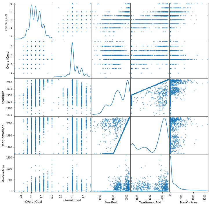
from pandas.plotting import scatter_matrix

scatter_df = df_train[["OverallQual","OverallCond","YearBuilt","YearRemodAdd","MasVnrArea","Street"]]
scatter_matrix(scatter_df, alpha=0.6, figsize=(12, 12), diagonal='kde')
plt.show()
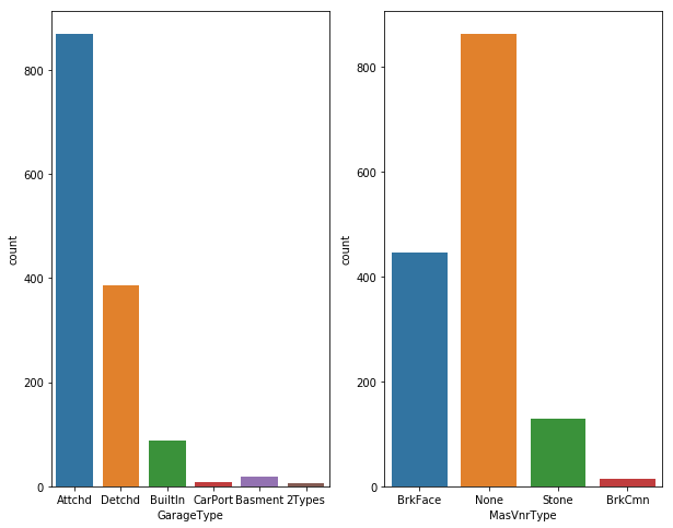
fig, axs = plt.subplots(ncols=2)
#plt.rcParams['figure.figsize'] = (10.0, 8.0)
sns.countplot(df_train["GarageType"],ax=axs[0])
sns.countplot(df_train["MasVnrType"],ax=axs[1])
plt.show()
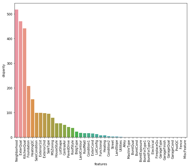
Moving forward, like we used correlation to determine the influence of numeric features on SalePrice. Similarly, we’ll use the ANOVA test to understand the correlation between categorical variables and SalePrice. ANOVA test is a statistical technique used to determine if there exists a significant difference in the mean of groups. For example, let’s say we have two variables A and B. Each of these variables has 3 levels (a1,a2,a3 and b1,b2,b3). If the mean of these levels with respect to the target variable is the same, the ANOVA test will capture this behavior and we can safely remove them.
While using ANOVA, our hypothesis is as follows:
Ho - There exists no significant difference between the groups. Ha - There exists a significant difference between the groups.
Now, we’ll define a function which calculates p values. From those p values, we’ll calculate a disparity score. Higher the disparity score, better the feature in predicting sale price.
from scipy import stats
from scipy.stats import norm
cat = [f for f in df_train.columns if df_train.dtypes[f] == 'object']
def anova(frame):
    anv = pd.DataFrame()
    anv['features'] = cat
    pvals = []
    for c in cat:
           samples = []
           for cls in frame[c].unique():
                  s = frame[frame[c] == cls]['SalePrice'].values
                  samples.append(s)
           pval = stats.f_oneway(*samples)[1]
           pvals.append(pval)
    anv['pval'] = pvals
    return anv.sort_values('pval')

cat_data['SalePrice'] = df_train.SalePrice.values
k = anova(cat_data)
k['disparity'] = np.log(1./k['pval'].values)
sns.barplot(data=k, x = 'features', y='disparity')
plt.xticks(rotation=90)
plt
C:\Users\Nithin\Anaconda3\lib\site-packages\ipykernel_launcher.py:18: SettingWithCopyWarning:
A value is trying to be set on a copy of a slice from a DataFrame.
Try using .loc[row_indexer,col_indexer] = value instead

See the caveats in the documentation: http://pandas.pydata.org/pandas-docs/stable/indexing.html#indexing-view-versus-copy
C:\Users\Nithin\Anaconda3\lib\site-packages\scipy\stats\stats.py:2958: RuntimeWarning: invalid value encountered in double_scalars
  ssbn += _square_of_sums(a - offset) / float(len(a))


<module 'matplotlib.pyplot' from 'C:\\Users\\Nithin\\Anaconda3\\lib\\site-packages\\matplotlib\\pyplot.py'>
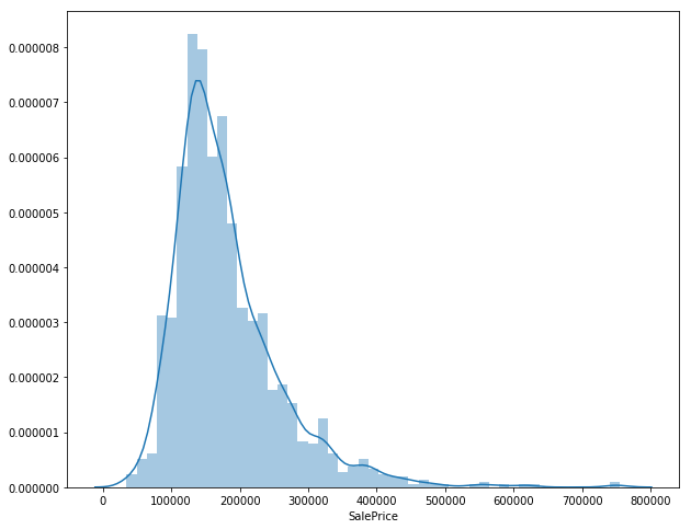
sales_price = df_train['SalePrice']
sns.distplot(sales_price)
<matplotlib.axes._subplots.AxesSubplot at 0x19793361b38>
qual_sales = df_train.groupby('OverallQual').agg({'SalePrice':np.average})
qual_sales.reset_index(inplace=True)
sns.set(style="whitegrid", color_codes=True)
sns.barplot(x='OverallQual',y='SalePrice',data=qual_sales)
<matplotlib.axes._subplots.AxesSubplot at 0x1978fe295f8>
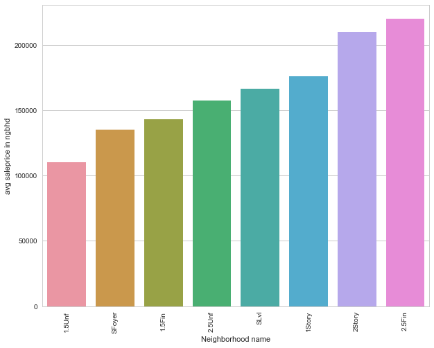
sales_group= df_train.groupby('HouseStyle').apply(lambda df:np.average(df['SalePrice']))
sales_group.sort_values(inplace=True)
sales_group
HouseStyle
1.5Unf    110150.000000
SFoyer    135074.486486
1.5Fin    143116.740260
2.5Unf    157354.545455
SLvl      166703.384615
1Story    175985.477961
2Story    210051.764045
2.5Fin    220000.000000
dtype: float64
sales_group = sales_group.to_frame()
sales_group.columns = ['avg saleprice in ngbhd']
sales_group.index.names=['Neighborhood name']
sales_group['Neighborhood name'] = sales_group.index
#sales_group_ngbr
sns.set(style="whitegrid", color_codes=True)
sns.barplot(x = 'Neighborhood name', y = 'avg saleprice in ngbhd', data=sales_group)
plt.xticks(rotation = 90)
plt.show()